HealthAnalyticsToolkit
Visualizations with R
There are a number of graphical visualizations you can create with R. Let us explore some of them!
We are going to be using the same dataset from this tutorial, starting with “mydata” available to us.
Watch this video to see the basics in action!
“The Default Scatterplot Function”
in_georgia <- mydata[mydata$state == "GA",]
Using a logical operator, we store all the rows for the state of Georgia in the in_georgia variable.
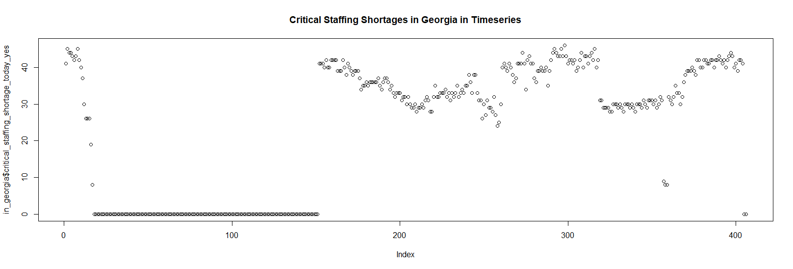
plot(in_georgia$critical_staffing_shortage_today_yes,main="Critical Staffing Shortages in Georgia in Timeseries")
Line Plot
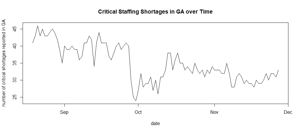
We can also use a line plot to look at the trends of this data!
To do this, we first make a list of the critical staffing shortages reported in Georgia to use as the y-value for our graph. To do this, we take the critical_staffing_shortage_today_yes from the in_georgia variable be previously made.
y <- in_georgia$critical_staffing_shortage_today_yes
Then, we locate the dates and use as.Date() to convert between character representations and objects of class “Date” representing calendar dates.
x <- as.Date(in_georgia$date)
Finally, we plot the data, specifically looking at the trend of critical staffing shortages reported during the fall (data points 200 to 300).
plot(x[200:300], y[200:300], type = 'l', xlab = "date",
    ylab = "number of critical shortages reported in GA",
    main = "Critical Staffing Shortages in GA over Time")
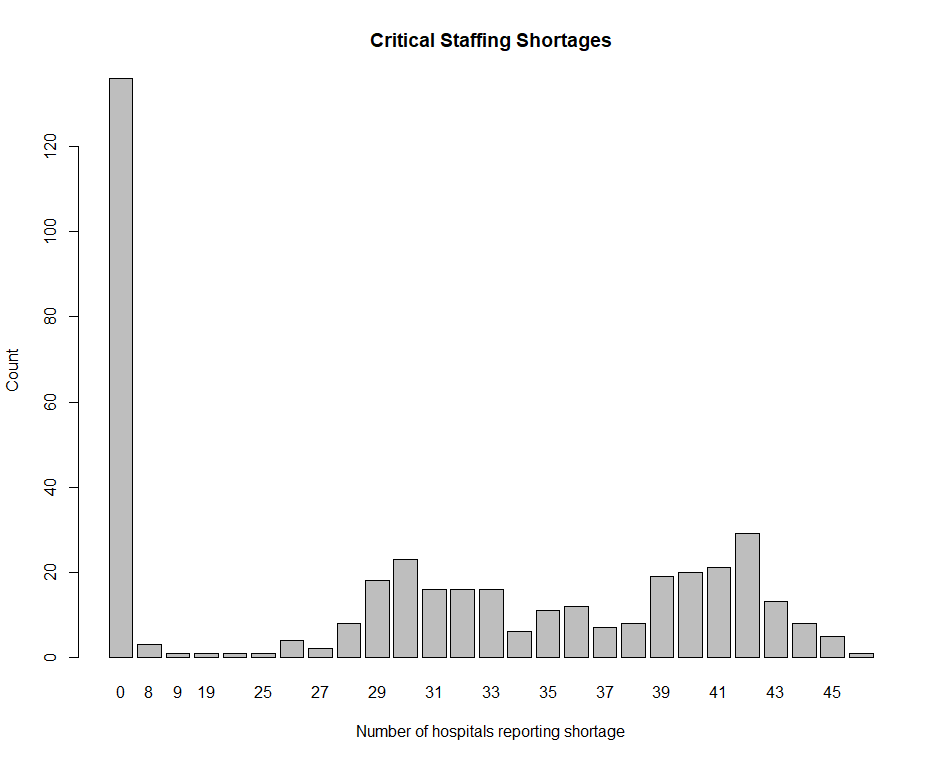
Barplot
count<-table(in_georgia$critical_staffing_shortage_today_yes)
0   8   9  19  24  25  26  27  28  29  30  31  32
136   3   1   1   1   1   4   2   8  18  23  16  16
33  34  35  36  37  38  39  40  41  42  43  44  45
16   6  11  12   7   8  19  20  21  29  13   8   5
46
1
To get count, we use table. According to R documentation, “table uses the cross-classifying factors to build a contingency table of the counts at each combination of factor levels.” Essentially meaning, it counts the instances of each number in the list given to it.
barplot(count, main = "Critical Staffing Shortages", xlab = "Number of hospitals reporting shortage", ylab= "Count")